KT Canada Conference – Day 1

I’m in Halifax for the Knowledge Translation Canada conference. Figured my blog would be a good place to collect my notes. There was also a hashtag of #KTCanada15 where people were tweeting their thoughts (and often tweeting out links to resources that speakers were referring to, which is super helpful, because then I don’t have to search them out myself – especially when I don’t catch the full reference.)

Opening Plenary: Richard Lilford, University of Warwick “Reconciling Scientific Rigour with Service Need”

  • there’s a tension between the rigour of science and the needs of health service (time – service needs answers now, doesn’t coincide with timelines for science)
  • controlled before & after studies – need pre- and post-design to account for baseline
  • stepped wedge study – different sites get intervention at different times, but pick order of sites by randomization
  • can even do stepped wedge nested stepped wedge (e.g. hospitals are stepped with region and regions are stepped)
    • pros: logistical, ethical & political (hard to go to clusters and tell them they will be a control group, especially when the intervention is promising; also often not easy to intervene at all places at the same time; a fair way to distribute the resource to sites); allows you to explore the interaction of time/intervention effect (e.g., often that as time goes on, effect weakens); suitable for large scale roll-out); often more statistically precise than alternatives
    •  cons: analytically complex; problem if randomization order is broken (e.g., if one site isn’t ready and you skip it, it screws up the stats); disadvantages that apply to all cluster studies, e.g., if you recruit individuals to a study and put them in a cluster, not as good as if cluster is a population)
      the use of stepped wedge design is on the increase
  • non-randomized stepped wedge – need to be concerned with if the sites are getting the intervention in conjunction with some other thing (e.g., you are giving the intervention to those deemed most in need first)
  • my current project will be a non-randomized stepped wedge design – should we be collecting data at the non-intervention sites (at least some subset of data) during the
    pre- phase, not just the baseline at 3-months prior to their go-live?
  • need Bayesian Epistemology
    • method 1: mental integration alone: systematic review, theoretical knowledge, pilot data, multi-level/multi-method observation –> consider all of this and decide on an estimate and a distribution
    • method 2: Bayesian Causal Network Analysis: I think this was coming up with estimates for each of the steps in the system
  • but sometimes you need a quantitative estimate (e.g., if you question is “is this intervention worth the cost?)
  • you may need to look at qualitative studies for some things
    triangulation – look at the pattern of data (e.g., if your data suggests it works, the literature suggests it works, the qualitative data points in the right direction – it gives you some confidence)
  • you can (and should) look at the literature of all the steps along the way
  • but sometimes you don’t have those direct measures
  • you often have data on the generic intervention (e.g., CPOE) and the outcome (e.g., adverse events)
  • you can measure process things (activities, outputs) and outcomes
  • when you are at the level of generic processes (e.g., should we change the nurse:patient ratio) – many possible outcomes (e.g., adverse events, quality of life, patient satisfaction, death) – sometimes called “an intervention with diffuse effects” and the outcomes aren’t just at the patient level, but at the level of service processes and clinical processes (his diagram is like a logic model!)
  • classifying health interventions
    policy (e.g. national/provincial) –> generic service process (e.g., policy in health org) –> targeted service process (make the process better, e.g. guidelines) –> clinical process (e.g., drug trial) –> patient outcomes
  • multiple end points
  • maintaining independence
  • some people are uncomfortable with the above: those who have too much confidence in quantitative (feel that the above isn’t objective enough) and those who are from qualitative (feel that you can’t reduce things to a number like this)
  • this is about science for decision-making (instead of science for hypothesis testing)
  • he evaluated the “Safer Patients Initiative” – IHI project to make hospitals safer – found huge improvements in outcomes, but seen in both the intervention *and* control hospitals
  • study where participants were given 2 studies (one with good methods, one with bad methods) that came to opposite conclusions on whether capital punishment is a deterrent for homicide. They asked them their opinion of capital punishment and then asked them to assess methods and people based their opinion of methods on which outcome they agreed with (not on the actual methods) (Source)
  • he thinks that different people should do the formative evaluation (who work with managers, may become invested in the program) and summative evaluation (who would be more objective)

intervening vs. encouraging innovation

  • closed-frame = describe what you need to do to intervene with fidelity
  • open-frame = tell people to do what they need to do in your context
  • science is about abstracting from the detail, not about the details itself
  • e.g., you can compare the new surgery vs. “usual care” and it’s OK if “usual care” is different at each site. In order to decide whether you should use the new surgery, do
  • you really need to exact details of what was done in each usual care instance, or do you just care if the new treatment is better than whatever was being done before?a

Oral Presentations

  • Decision Regret = negative emotion involving distress/remorse following a health-related decision; an important patient-reported outcome measure
  • Theoretical Domains Framework (TDF-2) – [look up this model]
  • James Lind Alliance Priority Setting Process
    • developed in UK in 2004
    • premise is to engage those not usually involved in research prioritization
    • an organized 4-step process
    • bring together patients, carers, and clinicians to identify and prioritize the treatment uncertainties/answered questions that they agree need to addressed
    • 4-steps:
      1. identify partners – those who can help you reach out to the population of interest; range of participation (e.g., steering committee, help you recruit, participate in final priority setting workshop)
      2. gather uncertainties – used open-ended questions in survey (online/paper/in person interviews) + literature/clinical practice guidelines (to look for listed uncertainties)
      3. process & collate submitted uncertainties – removed those out of scope, separated into categories, rolled those into “summary questions”, had people rank those
      4. final priority setting workshop – they did 1:1 clinician:patio ratio; people asked to rank the 30 questions they had created; facilitated group meeting – started with big group to explain what they were doing; asked people to talk about their top 3 and bottom 3 questions (and why they ranked them as they did), gave people the background to the questions (e.g., how many submissions from step 2 fed into that question); then explored where there were major discrepancies and why people ranked as they did; now shopping their top 10 around to e.g., Alberta Health Services and anyone else who might be able to advocate for these questions to be researched.

Panel Discussion

There was quite a bit of discussion about “what is a patient?” Some participants talked about having their voice silenced because they were seen as “too educated/informed” in health/healthcare, they aren’t an “authentic patient” because of this.
One person noted that asking patients to fill out a CV to be a “knowledge user” on a research grant sends the wrong message about what patients are brining (it’s not about them bringing their education/occupation, but rather about them bringing their lived experiences/values/perspectives.

To do:

  • find an online course in Bayesian statistics
  • read up on stepped wedge design (e.g., this article by Lilford)
  • look back at notes from my priority setting course in my MBA
Posted in event notes, healthcare, knowledge translation, notes, Uncategorized | Tagged , , , | Leave a comment

Webinar Note: Content Validation Evidence-Based Interdisciplinary Plans of Care

Enterprise-Wide, Evidence-Based Interdisciplinary Plan of Care Content Validation: Guiding Principles and Lessons Learned

Hosted by: Zynx Health
Presenters: Mary Swensen, RN, MBA and Naomi Mercier, MSN, RN-BC

I  attended this webinar as improving the translation of evidence into practice is one of the overarching themes of my career and is of relevance to the project that I’m working on right now, so I was interested to learn about how others are doing this. I was hoping that they would be talking about how they incorporated evidence into practice, but it turned out that they were focusing on the process they used to engage people in validating their content, as opposed to speaking about the content per se. It was still useful information, even though it wasn’t what I was expecting.

Here are the notes that I took:1

  • Partners Healthcare have not yet gone live with their interdisciplinary plans of care (IPOCs), but are explaining their process of how they developed them
  • Partners eCare – started in 2011, expected to have implemented Epic electronic health record and administrative system by 2017
  • huge process – in terms of scope, number of clients served, all of healthcare coming together to implement one system
  • have a history of excellent homegrown systems, but they don’t talk to each other
  • working on testing and training (will need to train 18,000 users)
  • March 2016 – will go live at 2 hospitals; Q1 in 2017 will go live with their other hospitals
  • 10 hospitals, each with different ways of doing plans of care
  • chose to go with a vendor solution (rather than home grown) – chose Zynx
  • wanted evidence-based IPOCs
  • wanted patient-centred, not discipline-centric
  • wanted an ongoing process for updates and maintenance
  • assembled a nursing leadership council; involved other health professionals early on
  • needed to standardize terminology/definitions
  • IPOC is considered part of the patients overall care plan=patient’s chart
  • defined: “plan of care”, “patient problem”
  • guiding principles
    • shared, inter-professional
    • active, patient and family-centred problems, goals
      • discipline-specific only if approach to care is so different that it couldn’t be shared
    • simple
      • only include problems that are barriers to a transition to a lower level of care or preventing the patient form meeting goals
    • no standard of care
    • minimal “at risk for”
    • active and relevant interventions
    • update goals and interventions with changes in patient condition
    • patient education documented (not part of plan of care)
  • did a Zynx-led content review bootcamp
    • 354 SMEs
    • 274 tasks in 50 working days
    • did a gap analysis of the developed content
      • noted that guiding principles were not applied consistently
      • variability in plan modifications (for a variety of reasons)
      • focus on interdisciplinary workflow slowed down the tailoring process
      • lack of style guide resulted in differing terminologies
    • post-boot camp, did a cross-walk of all problems created during the bootcamp
      • combined multiple versions of same problem  into one inclusive of all terms for review
      • had everyone review and comment
      • developed a style guide to help promote consistency
  • lessons learned
    • this was a starting point, not an end point
    • develop a style guide along with the guiding principles
    • cultivate interdisciplinary buy-in early in the process
    • “IPOCs templates using Therapies is a nirvana”
    • bigger is not better – you should “rightsize” the number of reviewers (sometimes they had too many people to many decisions
    • take the time to develop small groups of experts for review and validation
  • plan to update the plans every year, looking at the most frequently used IPOCs first
  • looking at a project that more actively involves patients in their own plans of care

To view a reply of the webinar, click here.

Posted in healthcare, information technology, notes, webinar notes | Tagged , , , | Leave a comment

Webinar on Tests of Change: Plan-Do-Study-Act

Watched a webinar on using PDSA to do test of change. Here are the (very rough) notes I took:

Tests of Change: PDSA Webinar
Hosted by Canadian Foundation for Healthcare Improvement (CFHI)

  • PDSA = Plan-Do-Study-Act
  • The Model for Improvement  (Langley et al, 2008 – The Improvement Guide)
    • Aim: what are we trying to accomplish
    • Feedback: how will we know a change is an improvement?
    • Change: what change can we make that will results in improvement
    • PDSA cycles
  • We do PSDA cycles everyday (but don’t often call it that) – come up with ideas for improvement, test out the idea, see how it works,
  • It’s difficult to predict effectiveness (which we overestimate) and effort (which we underestimate) – lots of evidence for this from behavourial economics (Thinking Fast & Slow summarizes this research)
  • history
    • Shewhart – came up with the control chart
    • Lewis – a philosopher – pragmatism
    • Kolb’s cycle (related to PDSA) “Experiental Learning cycle”: active experimentation, concrete experience, reflective observation, abstract conceptualization (and the cycle continues)
  • you can’t have improvement without learning (though you can have learning without improvement)
  • why use PDSA?
    • testing on a small scale can help you to:
      • predict how much improvement can be expected from the change
      • learn how to adapt the change to conditions in your local environment
      • evaluate costs and side-effects of the change
      • minimize resistance upon implementation – telling people “we are testing it and we want to know what you think about it?” has a much different effect rather than “this is the new thing we are doing”
  • difference between PDSA and pilot:
    • PDSA – early cycle prototypes, proof of concept, spirit of inquiry
    • pilot – fully developed change, spirit of confirmation, few (if any) iterations
  • difference between testing and implementation
    • testing: temporary, subset of population, learn what change works, adapt/modify change, may test a single factor
    • implementing: “permanent”, whole population, make change, make a change standard, if multifactorial change – all factors
  • driver diagrams – have process and outcome measures – are a good place to start when doing Planning – what to change? what will you to measures your change?
  • when we start, we have some belief that the change will –> improvement – and the degree of belief may change as a you plan (and learn more), and then when you due cycles to test the change (we may learn it works or we may learn it doesn’t or we may learn which parts work) (graph of this in The Improvement Guide)
  • from an idea – develop the change, test the change, adapt/adjust/adopt, implement the change
  • Before PDSA: “What’s the largest thing you can do to test the change next Tuesday?”
  • It is possible to have a test that is too small, but usually people wait too long and make tests bigger than they need to
  • Note: it’s not a small CHANGE, it’s a small TEST we are looking for
  • You can use simulation to run a test
    • works well when interested in rare events or when the risk of failure is high
  • You can have people “review and comment” as a PDSA
  • Test with just one person, one provider, one patient, one client
    • you can’t learn something that’s generalizable from a test with one person – but you can learn
  • Testing on a small scale
    • try out new ideas before implementing the
    • break down new changes into a series of small tests that you will study and modify (if needed)
    • no important change will “fit” your system perfectly
    • you want to work the bugs out before you implement
    • does need to be large enough test for it to be informative (e.g., a tiny paint chip makes it difficult to really envision your whole room that colour)
  • What thinking about a PDSA cycle, challenge how much time you need to run a cycle. I fyou are thinking a month-long teset, what you could do in a day? If you are thinking of a week, what could you test in an hour?
  • Over time, you take your PDSA cycles up a ramp – from theories/hunches/ideas up through increasing complexity/number of people/different situations –> changes that result in improvement
    • very small scale tests –> follow up tests –> wide scale tests of change –> implementation of change –> spread
  • size of test – consider:
    • risk of failure
    • confidence in the change
    • resistance/readiness for change
  • Planning:
    • objective: aim, predictions
      • can undercover potentially unintended/unwanted consequences
    • plan for change – what are you changing? who is doing what? what are you measuring?
      • how will you know that change was done as planned?
      • how will you know that the change resulted in some positive effect?
      • can you build data collection into daily work processes? (make data collection as easy as you can)
        • can you use existing sources or will you have to gather new information?
        • how will you collect qualitative observations/data?
    • 4 test designs:
      • observational
      • before-after
      • time series
  • Do – run the test
  • Study
    • analysis of data
    • compare theory/prediction and results
    • summarize lessons learned
    • someone needs to record observations, harvest learning
    • look for:
      • what works
      • what doesn’t work
      • what adjustments are needed
    • be open to abandon the idea if it doesn’t work
      • sometimes people get so invested in the idea that they don’t want to abandon it, even when it doesn’t work
  • Act
    • not that same as “do” – it’s about consolidating ourlearning and figuring out what to do next
    • continue, modify, or re-direct efforts
    • what next?
    • any new theories or ideas?
  • You can (should?) engage patients and families in:
    • planning & selecting good change ideas
    • reviewing results of PDSAs

Update: Here’s a link to a video of the webinar.

Posted in methods, notes, webinar notes | Tagged , , , , , | Leave a comment

Webinar Notes: Soft Systems Methodology: The Use of Rich Pictures from Evaluation

As part of EvalYear 2015, the School of Public Affairs at the University of Colorado Denver, is holding a webinar series called: “Practical Applications of Systems to Conduct Evaluation: Cases and Examples“. They have a great list of 30 minute webinars running from January to June related to use of systems thinking in evaluation. Systems thinking is something I’ve been reading up on lately, so these webinars are very well timed from my perspective!

Title: The Use of Rich Pictures in Evaluation
Speaker: Judy Oakden, independent evaluation consultant
Date: 8 April 2015

This was a very interesting webinar as it introduced me to a methodology that I’ve not heard of before: Soft Systems Methodology and explained a bit about the use of one of the methods from that methodology: rich pictures. The webinars are only 30 minutes long, so they are really meant to just whet your appetite and give you some practical tips on applying methods related to evaluating complex systems, and this seminar definitely archived that objective for me!

Here’s the notes I took during the webinar:

  • “rich pictures” is a tool to help visualize problematic situations that you want to unpack to aid in the development of an evaluation framework, the evaluation questions, etc.
  • rich pictures help you to:
    • isolate key issues quickly
    • avoid being overwhelmed
    • manage emerging or changing circumstances
    • represent a wide range of stakeholders
    • understand interconnections
    • understand problematic situations
  • need to have the right people in the room to facilitate the creation of a rich picture
  • rich pictures can be easily merged into existing evaluation practice
  • use rich pictures at the start of an evaluation to help understand the territory
  • comes from “soft system methodology” (been in existence for ~40 years – but relatively unknown to many evaluators)
  • don’t need to use the entire methodology – can just use some of the tools
  • how do you make a rich picture?
    • address context and dynamics when working in groups
      • work best when the group has gotten through form, storm, norm
      • don’t want to start with this – groups need to form
      • 3-6 people working on a picture
      • consider the power dynamics of the group (e.g., mix up managers with staff, etc.)
      • consider confidentiality – some of the things people will draw are the “elephants in the room”/”the unmentionables” – since we know these will come up, need to consider how we will manage confidentiality (state at the start – “what’s said in the room, stays in the room”)
    • instructions for participants
      • systems.open.ac.uk/materials/T552/ – open university material on instructions on rich pictures (and some other diagramming techniques)
      • make sure the participants know what they need to do
      • make sure the participants know what question they are being asked to answer
      • test the question before you run the session (to make sure it’s not ambiguous)
      • picture needs to include structure, process, issues/concerns/yourself (and roles/relationships of people)
      • don’t need to map the entire system – just the part you are dealing with
    • set expectations of ambiguity
      • often a big pause as people think about what they need to do
      • trust the process – and ask the participants to trust it too (“I promise you it will work!”
      • set the expectation that ambiguity is OK
      • provide reassurance and timely feedback during the process
      • doesn’t matter where you start on the picture, just get started
      • often one (or a few) person will
    • looks for ideas, not perfect drawings
      • messy drawings is fine
      • doesn’t need to be an artistic masterpiece
    • some people feel that having to draw slows down their communication (they are used to being articulate, but struggle to draw even a stick figure)
    • can be overwhelming (when you see how complex the situation is) – reassure them that this is normal
    • work on drawing for 30-50 minutes (depends on the complexity of the situation – e.g., one group they’d given the group 45 minutes, but they could see they weren’t done, so ended up giving them 55)
    • then analyze!
    • drawing itself is often unintelligible – those who made it can tell a compelling story of the picture, so ask the participants to explain their picture – “this is where the magic happens!”
      • give 5-8 minutes per drawing
      • audiotape the explanation
      • don’t read into the pictures – get the explanations from those who drew it
    • she doesn’t show the pictures in their reports – it’s the raw data that gets interpreted (not meant to be a product itself – it’s a way to get to the ideas/emotions)
  • one audience member asked how “rich pictures” compare to “anecdote circles”, but the speaker and facilitator hadn’t heard of that before (and neither have I!), so I googled it (and it turns out that they are a completely different thing than rich pictures).

So, it looks like I’ve got some homework to do: reading up on Soft Systems Methodology, checking out these tools, and checking out the references on the last slide of the presentation slide deck.

Other webinars from this series that I attended:

View the slides here and view the whole presentation on YouTube.

Posted in evaluation, evaluation tools, event notes, methods, notes, webinar notes | Tagged , , , , , , , | Leave a comment

The “Iron Law of Purpose”

I was working on a presentation about “validity” for a group that is working on developing a survey and came across the following as I was looking something up in one of my research methods textbooks:

Simply stated, the iron law of purpose declares that you cannot evaluate anything without a conception of its purpose. […]

Any act of evaluation requires an act of choosing, of deciding which alternative is preferable. The act of deciding, in turn, requires an assessment of the consequences of various alternatives. However, assessing consequences (outcomes) requires a prior conception of purpose. In short, without a conception of an object’s purpose, you cannot evaluate its consequences. If you cannot assess an object’s comparative consequences, you cannot evaluate its worth. This proposition can be labelled a ‘law’ because it applies to everything – from hammers to sweethearts, from vegetables to your life. If you are unclear on what anything is for (its purpose), you cannot assess how worthwhile it is 1Source: : Roberts et al (2009). The Methods Coach: Learning Through Practice. Don Mills, ON: Oxford University Press Canada. p. 53.

I quite like this quotation, as it’s something that I find myself coming up against quite often. I find that often when people want to start working on an evaluation, they jump to one of the following:

  • “We need to do a survey!” or “a focus group” or “a randomized controlled trial”… or just about any other method or study design. When I start to ask questions about how they decided on that method or design, it usually comes out that they think it’s the only way to evaluate or that “we can only afford (or we only have the skills to do) surveys”. Sometimes, people aren’t even clear on what question(s) they want to answer with their evaluation, but they’ve already decided on the method to answer whatever question they come up with.
  • “Oh, you are going to do an evaluation? Well, we already collect data on [fill in the blank with any number of things they might be collecting data on], so you should measure that.” Again, they often haven’t even thought about what question(s) they want to answer with their evaluation, but they’ve already decided on a way to measure the outcomes 2or activities or outputs, etc. (which may or may not be the outcome that they are even trying to affect!
  • Them: “I need an evaluation!”  Me: “What about your program would you like to evaluate? What would you like to know?” Them: [blank stare]… “I need an evaluation!”

All three of these situations, which I have experienced more than once, amount to the same thing – forgetting to think about what the purpose of their evaluation is and either (a) immediately jumping to how to get to an answer (despite not knowing what the question is) – and really, how can you design a good evaluation if you don’t know what its purpose is? or (b)  not even knowing where to start.

Fortunately, there is a good place to start! Figure out what you want to know, and then decide on the best way to get that information. You can think about this by asking things like:

  • What is the purpose of the evaluation? What do you want to know?
    • e.g., Do you want to know if your program is achieving its objectives? 3Which, of course, requires that you know what your objectives are. You’d be surprised how often people haven’t articulated what they are intending their program to achieve. But that’s a topic for another blog posting entirely – the Iron Law of Purpose applies to your program as well as to your evaluation!.
    • e.g., Do you want to know if you are implementing your program the way it was designed?
    • e.g., Do you want to know what’s going well in your program and what’s not going well?
  • What question(s) are you trying to answer with this evaluation?
  • What do you want to be able to do with the results of the evaluation?
    • e.g., to improve your program? to decide if the program should be kept or stopped? to decide if the program should be expanded to other places?

So one of my big pieces of advice when it comes to evaluation really is to start with figuring out what you are doing it for, because to design a worthwhile evaluation, you have to know what you want to get out of the evaluation at the end of the day. And, as Roberts said, “If you are unclear on what anything is for (its purpose), you cannot assess how worthwhile it is.”

Footnotes

Footnotes
1 Source: : Roberts et al (2009). The Methods Coach: Learning Through Practice. Don Mills, ON: Oxford University Press Canada. p. 53
2 or activities or outputs, etc.
3 Which, of course, requires that you know what your objectives are. You’d be surprised how often people haven’t articulated what they are intending their program to achieve. But that’s a topic for another blog posting entirely – the Iron Law of Purpose applies to your program as well as to your evaluation!
Posted in evaluation, methods | Tagged , , , , | Leave a comment

Webinar Notes: Systems Dynamics: Computer​ Models to Anticipate and Plan for Surprise

As part of EvalYear 2015, the School of Public Affairs at the University of Colorado Denver, is holding a webinar series called: “Practical Applications of Systems to Conduct Evaluation: Cases and Examples“. They have a great list of 30 minute webinars running from January to June related to use of systems thinking in evaluation. Systems thinking is something I’ve been reading up on lately, so these webinars are very well timed from my perspective!

Here’s the notes I took during the webinar 1Technically, I took these notes after the webinar as I experienced a technology problem and the site wouldn’t let me log on during the session. I viewed the recording later.:

Systems Dynamics: Computer​ Models to Anticipate and Plan for Surprise
Speaker: Jeff Wasbes
Date: 12 March 2015

  •  computer simulations can help us anticipate surprise
  • not talking about statistical models, but rather talking about dynamic computer models that help us to understand how structure of a system affects its behaviour
  • endogenous = arising from within
  • system dynamic models are “rich with feedback loops”
  • when you examine a system deeply enough, you can find “leverage points” (places where making small changes –> big results)
  • when you find “leverage points”, you can use them (change the structure of the system at those points to get the results you want)
  • “Models don’t need to be complex. Models need to be useful”
  • don’t model a system for the sake of modeling a system – model a problem – make the model useful
  • computer modeling is more cost (and time) effective than running a system in the real world
  • three pieces of a system:
    • elements
    • interconnections (to link the elements to each other – with simple rules [e.g., an increase in A leads to an increase in B])
    • function
  • e.g. of systems – schools, cities, policies, programs
  • elements pass information to each other through interconnections
  • complexity – when cause-effect relationship change and adapt (and what causes these changes/adaptions often arises from within – feedback loops)
  • feedback behaviour is dynamically complex
  • combinatory complex – has lots of parts, but linear interactions – relatively easy to predict
  • dynamically complex – nonlinear interactions – difficult to predict
  • models help us separate the signal from the noise
  • why are systems relevant to evaluation?
    • programs and policies (which are complex systems) are implemented into complex environments
    • sometimes what we think is a solution can actually be exacerbating a problem
    • without understanding the system, the feedback loops, etc., we might be causing unintended consequences
  • models help us communicate about complexity
  • many social systems are in a “comfortable equilibrium” – stable, tends to go back to that equilibrium when perturbed
  • having an understanding of how a system might be expected to work can help us to, for example, decide what/when/how to measure things
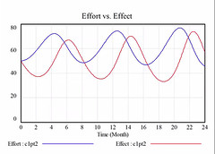
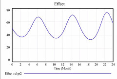
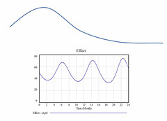
  • example: let’s say you have a system with a feedback loop between effort and effect, such that you put in effect, see an effect, you relax your effort (because you saw the effect), effect drops a bit, so you increase effect – result: an oscillation in the result around the level that you want it to be:

2015-03-12 webinar screenshot 1

2015-03-12 webinar screenshot 2

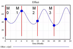
  • but let’s say you only take a measurement of the effect every 6 months:

2015-03-12 webinar screenshot 3

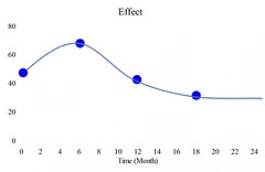
if you don’t know about the underlying oscialation pattern, you’ll see this:

2015-03-12 webinar screenshot 4

  • which will lead you to quite different conclusions than what is really going on:

2015-03-12 webinar screenshot 5

  • so modeling the system to get an understanding of what might be the underlying pattern can  be useful in helping us to think through our results and our measurement plans
  • stakeholders should be involved in the development of the model and a model should be seen as a “living” entity that is subject to change as you learn more Vensim.com – a free software for personal or academic use (or license for commercial use) to do systems modeling

Other webinars from this series that I attended:

Images: screenshots from the webinar. View the whole presentation on YouTube.

Footnotes

Footnotes
1 Technically, I took these notes after the webinar as I experienced a technology problem and the site wouldn’t let me log on during the session. I viewed the recording later.
Posted in evaluation, evaluation tools, event notes, methods, webinar notes | Tagged , , , , , | Leave a comment

Webinar Notes: “Cross Boundary Insights: Plans, Critical Incidents, and Outcomes” by Jonathan Morell

As part of EvalYear 2015, the School of Public Affairs at the University of Colorado Denver, is holding a webinar series called: “Practical Applications of Systems to Conduct Evaluation: Cases and Examples“. They have a great list of 30 minute webinars running from January to June related to use of systems thinking in evaluation. Systems thinking is something I’ve been reading up on lately, so these webinars are very well timed from my perspective!

Here’s the notes I took during the webinar:

Webinar: Cross Boundary Insights: Plans, Critical Incidents, and Outcomes
Speaker: Jonathan Morell   jamorell.com/
Date: February 11, 2015

  • This example is not an entire, self-contained evaluation method on its own, but a way to do some analysis – still need to do other things
  • started as a simple exercise looking at timelines, but he looks at things in terms of complexity
  • had a project plan
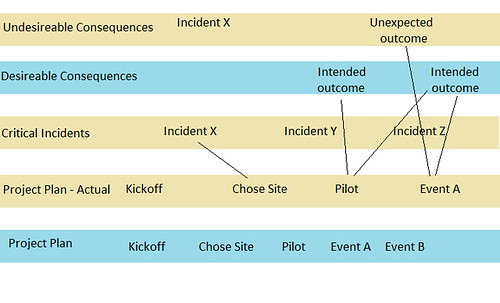
  • added critical incidents 1Determine critical incidents by asking “what happened that really affected the program for better or worse?” or “what do you think will happen that would affect the program for better or worse?”, desirable consequences & undesirable consequences, which he added to the timeline
  • colour coded items that were unexpected
  • things never go according to plan
  • mapped out the “actual project plan”, compared to original timeline
  • there are good reasons why plans don’t work out:
    • people are optimistic – overestimate our abilities and underestimate the things that will get in the way
  • should look at how long similar projects have taken
  • looked at why the delays happen, which he did by looking at the critical incidents – though not sufficient on its own, it’s useful – and see how they affected the timeline
  • he also looked across the different lanes

Webinar on 11 Feb 2015

  • Used the timeline to try to understand the uncertainty
  • Used the critical incidents to try to understand what happened and how it affected timeline
  • Used desirable and undesirable consequences to understand effects
  • Suggests that collecting a little bit of data often is better than collecting a little bit of data less frequently
    • if you see something interesting, can do a deeper dive (but if you only collect data infrequently, you might miss stuff)
    • can have a short conversation with people involved – “What’s going on?”
    • keep your ears open, ask simple questions
  • you also need to monitor the outside world – the outside world affects your stuff too
  • when asked how he sells this type of work to the evaluation client who just wants to know if they achieved their intended outcomes (and is afraid of talk of complexity), he felt that you don’t need to tell the client that you are thinking about complexity
  • his view on evaluation capacity is that people should: “Respect data. Trust judgment” (his tagline)
  • people wouldn’t hire you as an evaluator unless they believed that what they are doing is going to work

Host: Danielle Varda

Other webinars from this series that I attended:

Footnotes

Footnotes
1 Determine critical incidents by asking “what happened that really affected the program for better or worse?” or “what do you think will happen that would affect the program for better or worse?”
Posted in evaluation, evaluation tools, notes, webinar notes | Tagged , , , , , , | Leave a comment

Webinar Notes: Analyzing Data Over Time for Quality Improvement

The Canadian Foundation for Healthcare Improvement (CFHI) is offering three webinars on Measurement for Quality Improvement. These are my notes from the third webinar: Analyzing Data Over Time for Quality Improvement: A Focus on Control Charts (I missed the second webinar and haven’t had time to go watch the archived video yet)

Speaker: Melanie Rathgeber

Control Charts

Xbar chart for a paired xbar and R chart.svg
Xbar chart for a paired xbar and R chart” by DanielPenfieldOwn work. Licensed under CC BY-SA 3.0 via Wikimedia Commons.

  • look like run chart
  • has:
    • centre line (mean)
    • upper control limit (mean +3 SD)
    • lower control limit (mean – 3SD)
  • can’t make these in Excel (need stats software that calculates the limit for you)
    • QI Macros Excel add on or QI Charts Excel add on allow you to do control charts
  • not the same as confidence intervals
  • no “p-value” in control charts – that answers a different question
  • probability that we misinterpret conclusions (less than ~11% – depends on specific chart, but quite low)
  • why would you use a control chart instead of a run chart
  • if doing a QI project and want to know if we see improvement, we can use run charts
  • control charts allow us to dig deeper (e.g., bigger QI project, lots of data points, running healthcare operations over time)
  • control chart allows us to see variation
    • sometimes we have intended variation (e.g., we chose to do different things for some patients than others)
    • unintended variation is where we want to see an improvement
      • common cause variation (e.g., if you weigh yourself every day, you’ll see variation due to hydration level, etc.)
      • special cause variation (e.g., if you step on the scale after the Christmas holidays and you see you’ve gained weight)
        • special cause variation can be either desirable or undesirable
      • control charts are a bit more sensitive, pick up variation more quickly
    • things when you want to use a control chart instead of a run chart
      1. evidence of special cause variation (e.g., improvement)
      2. different sample size for each time period
      3. is system stable and predictable (e.g., data always within the control lines; if it’s not, remove special causes before trying to do improvement. when you do improvement projects, you want to have a stable system first)
      4. what will be the result next month?
      5. what are the sources of variation? (e.g., instead of time on x-axis, could have different departments and see if things vary by department)
    • analyzing a control chart
      • have to tell the software what type of data you have
        • e.g., percent data – P chart; count data – C chart; count data as a rate – U chart, averages (with subgroup size >1) – X bar and S; individual data or data that comes precalculated – I chart)
      • create control chart once you have about 12 data points
      • should have about 20 data points before establishing control limits and doing the analysis
      • finding special causes:
        • single point outside of control lines
        • shift: 8 or more consecutive points above or below centre
        • trend: 6 consecutive points increasing or decreasing
        • two of 3 points near a control limit
        • 15 consecutive point close to centre line
      • revise the limits as required – e.g., analyze data based on the initial state, but if you see an improvement where the data is shifted down, you’d then recalculate the limits to this new state (as you may want to see further improvement projects)

Speaker: Using Data with Healthcare Performance Improvement Initiatives

  • healthcare fits the classic definition of a system: “a group of interacting, interrelated, or interdependent elements forming a complex whole” (IDC, 2012)
  • even top-performing health care organizations are unlikely to acheive high quality in every aspect of their performance
  • complexity of healthcare demands a robust approach to measuring and improving quality
  • analytics allows us to see:
    • is our system in control?
    • is variation random or due to a special cause?
    • can we predict future results?
  • many QI initiatives begin with a good idea, but they aren’t evaluated
  • many QI methods are used in healthcare: PDSA (little experiments), Lean (reduce waste/non-value added activities, increase value added activities), Six Sigma (reduce variation/deviation in processes – define, measure, analyze, improve, control), Total Quality Management
  • how do you decide which method to apply?
  • how do you know how to analyze the data you get when using these different QI methods?
  • linking data and analytics with QI methods
    • define problem and desire outcomes
    • determine appropriate metrics and indicators
    • build appropriate analytic tools
    • disseminate to stakeholderes

You can view a recording of this session ($69 for one session or $250 for all 3) on the CFHI website (not up yet, as the workshop was today, but should be up soon. 1Disclosure: I have received a grant from the the CFHI in the past and am currently an “Improvement Coach” on one of their projects. I don’t receive anything for blogging about their workshop – I’ve just found them useful and wanted to share what I’m learning and I wanted to be transparent that I’ve received funding from them for projects.

Footnotes

Footnotes
1 Disclosure: I have received a grant from the the CFHI in the past and am currently an “Improvement Coach” on one of their projects. I don’t receive anything for blogging about their workshop – I’ve just found them useful and wanted to share what I’m learning and I wanted to be transparent that I’ve received funding from them for projects.
Posted in data analysis, event notes, methods, webinar notes | Tagged , , , , | Leave a comment

Webinar Notes: Making Data Matter: Measurement Basics for Quality Improvement

The Canadian Foundation for Healthcare Improvement (CFHI) is offering three webinars on Measurement for Quality Improvement. These are my notes from the first webinar: Measurement Basics for Quality Improvement (which was held on Oct 22, 2014, but which I realize I haven’t posted until now!)

  • data helps guide decision making and helps us know where to focus time, attention, and resources
  • wherever possible, collect data as part of existing processes
  • you can collect small samples of data in real time and validate against later data set later on
  • in improvement projects, we typically aren’t asking about “statistical significance”, but rather we want to know if the data changes over time

Run Charts
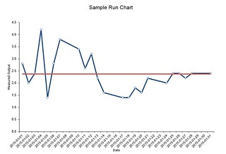
run chart

  • data displayed with time on x-axis
  • can measure process measures or outcome measures
  • collected weekly or monthly and plotted as you get it
  • centre line = median or baseline
  • recalculate the median once you see a trend or shift
  • helps you see:
    • baseline
    • how results are changing over time
    • when you reach a target
    • in you sustain that target over time
    • natural fluctuations
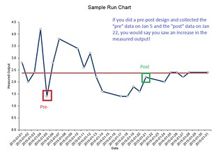
  • if you only measured pre vs. post, you can end up finding “statistically significant” results when they might just be different due to fluctuations

run chart - vs pre-post

  • analyzing run charts:
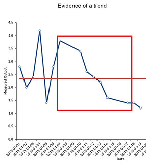
    • evidence of a trend: 5+ consecutive points going in the same direction (up or down)

evidence of a trend

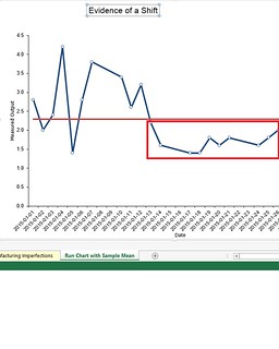
  • evidence of a shift: 5+ consecutive points on one side of the median (either above or below); less than 5% chance of seeing this if there isn’t really something going on

evidence of a shift

  • can compare process and outcomes (e.g., number of people attending a diabetes education program with number of patients with controlled blood glucose) – can help explain things going on with the outcome

Resources:

  • IHI’s Run Chart Tool
  • You can also do these in Excel – there’s even a built in template
  • The run chart: a simple analytical tool for learning from variation in healthcare processes. BMJ Quality & Safety 20(1), 46-51. (requires a subscription)

You can view a recording of this session ($69 for one session or $250 for all 3) on the CFHI website. 1Disclosure: I have received a grant from the the CFHI in the past and am currently an “Improvement Coach” on one of their projects. I don’t receive anything for blogging about their workshop – I’ve just found them useful and wanted to share what I’m learning and I wanted to be transparent that I’ve received funding from them for projects.

Footnotes

Footnotes
1 Disclosure: I have received a grant from the the CFHI in the past and am currently an “Improvement Coach” on one of their projects. I don’t receive anything for blogging about their workshop – I’ve just found them useful and wanted to share what I’m learning and I wanted to be transparent that I’ve received funding from them for projects.
Posted in data analysis, methods, webinar notes | Tagged , , , , , , | Leave a comment

Webinar Notes: “Emergence: Detection and Interpretation in a Leadership Program” by Michael Quinn Patton

As part of EvalYear 2015, the School of Public Affairs at the University of Colorado Denver, is holding a webinar series called: “Practical Applications of Systems to Conduct Evaluation: Cases and Examples“. They have a great list of 30 minute webinars running from January to June related to use of systems thinking in evaluation. Systems thinking is something I’ve been reading up on lately, so these webinars are very well timed from my perspective!

Here’s the notes I took during the webinar:

“Emergence: Detection and Interpretation in a Leadership Program” by Michael Quinn Patton

  • complexity in the evaluation world
    • traditional logic models are linear
    • but in the real world, there are forks in the road, sidetracks, unexpceting things, challenges, and opportunities
  • Tracking Strategies by Henry Mintzberg
    • intended strategy – deliberate strategy – implemented as intended
    • but some of what was intended isn’t implemented (unrealized strategy) – and that’s OK
    • emergent strategy – opportunities arise that weren’t part of original strategy, so some strategy emerges on the fly
    • high performing organizations have a “realized strategy” of deliberate + emergent (an unrealized strategy is that which was planned by not done)
    • and then look at what the outcomes of that realized strategy was
  • documenting all of this is part of the evaluator’s role as this occurs
    • why they decided to leave some things unrealized?
    • why did they add the new stuff?
    • people making the decisions typically do not document why they make their decisions
  • traditional accountability thinks any unrealized strategy as a failure (didn’t do what you planned) and emergent strategy as “mission drift” (you did stuff that you didn’t plan on) – but the research on high performing organizations doesn’t support this way of thinking
  • emergence – what to watch for
    • subgroups – how do people self organize with a program? there can be results not just on individuals but on (sub)groups
    • critical incidents
    • issues
    • staff-participant relationships
    • processes
    • outcomes
    • impacts
    • non-linear effects (ripple)
  • in highly dynamic environments, it doesn’t make sense to make detailed plans for long time periods (because you can’t predict what’s going to happen over long time frames); makes sense to have a strategic vision and principles that you operate under, and details will emerge
  • you are operating under situations of uncertainty, you aren’t going to be getting “proof” – you are thinking in terms of probabilities
  • having some data is better than no data, and waiting for complete data isn’t feasible (things are dynamic, so you can’t get “complete” data anyway) – real time pressures to make decisions, use the best information you have and recognize the uncertainty
  • developmental evaluators need to walk alongside the program people
  • developmental evaluation is scary for both the program people and the evaluator – you don’t have a roadmap to follow – you develop the evaluation as you go along
  • when people are talking about innovation and the need for new ideas – that’s where you will (should?) find people willing to try out developmental evaluation
  • companies spend lots on R&D – they get the need for creation/experimenting/testing, but governments and NPOs tend not to put their resources there

Action Items

Posted in evaluation, event notes, methods, webinar notes | Tagged , , , , , | 2 Comments